You probably know the duck-rabbit picture through which Ernst Gombrich described the necessary ambivalence of art and how the viewer’s perception functioned. Gombrich claimed that we cannot see the image apart from its interpretation, and that we cannot see two images at the same time, i.e. we see either a duck or a rabbit, but not both simultaneously. On the basis of ambivalence, Taavi Talve and Dénes Farkas easily overturn the simultaneity claim: Footnotes 2 is a work where the simultaneity of the interpretation of images and signs in viewers’ consciousness leads to misreading the word, and erroneous reading leads to the philosophically correct answer.
Dénes Farkas & Taavi Talve. Joonealused (Footnotes). Monumental Gallery, Tartu Art House. 19 August–11 September 2011
Dénes Farkas & Taavi Talve. Footnotes 2. Draakoni Gallery, Tallinn. 31 October–12 November 2011
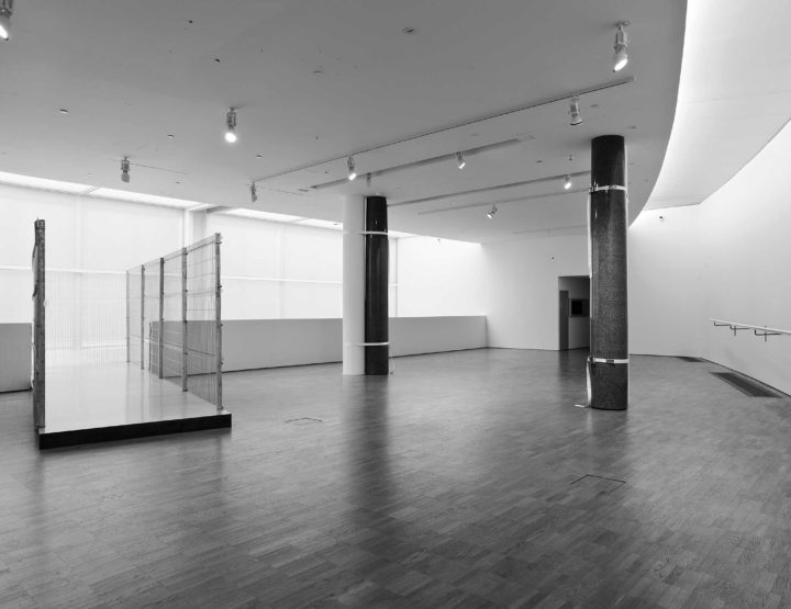
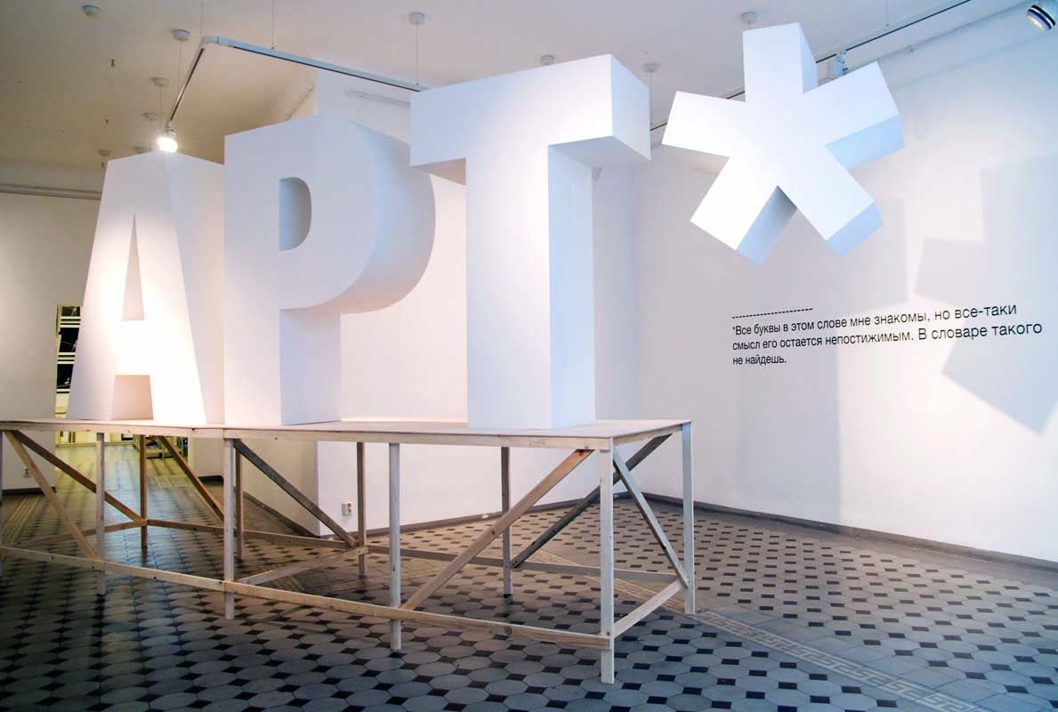
Taavi and Dénes displayed their installation Footnotes 2 in the Draakoni gallery in Tallinn, a rather compact exhibition space with a big Jugendstil window and patterned floor right across the road from the Russian embassy. The white sculptural and massive letters APT, in Helvetica typeface, were not placed on the floor as representatives of democratic sculpture, but were instead placed on a veneer podium resembling scaffolding or a work desk. The asterisk at the end of the word hung from the ceiling and a text in Russian behind it on the wall imitated the footnote comment: “All the letters in this word are familiar to me, but the meaning still remains unclear. It is not in the dictionary.”
The white letters in a white gallery cube seem simultaneously declarative and slogan-like, as well as extremely delicate and non-material, although it is still the language which establishes the rhetoric of the power of minimalism. How do the artists behave, and are they helping the viewer in any way? Even in the traditional paratextual paragraphs that supplement the exhibition, the artists remain as curt as possible. They also extend the atmosphere of the display into the emailed press release, repeating the footnote’s text on the wall, the footnote’s definition and its graphological formatting.
Taavi Talve and Dénes Fakas place anyone wishing to talk about Footnotes in a difficult situation, because the art criticism narrative is temporal and consists of sentences and references, but the work of Dénes and Taavi is a whole that stands still in time and in the viewer’s gaze. All meanings and meaningful associations are simultaneously open and important, so that this work cannot be described as a sequence of thoughts or associations, where the next develops from the previous. No, all thoughts are there at the same time. As a viewer I feel that I am fully subjected to the footnote’s form, which also contains simultaneous information. The word to which the footnote explanation is added does not actually lead to the explanation, but at that moment the word itself has the meaning indicated in the footnote; except, the reader does not (yet) know it. Reading the text with footnotes also means constantly returning to the main text; after a brief break from the text’s narrative, we carry on, as if there had not been any disruption, but now we are a bit more informed, instructed, perhaps even enough to really understand the discursively corrected text.
The series Footnotes inevitably, directly and physically brings us to the concept of cultural space. This work only addresses the viewer who possesses the bilingual or two-mode reading skills of the transition era; a viewer whose cultural memory includes both Soviet and contemporary Western codes of language and art. First, we need to know Russian – if not enough to read the footnote on the wall, then we should certainly be able to read the alphabet. At the same time, the viewer needs some knowledge of the English language, at least to understand the word ‘art’. The form and aesthetics of the work also originate in two places: the first link is inside art and regards the installation as an example of classical Western minimalism and conceptualism, which we know from art museums and art history reproductions. At the same time, with minimalism and conceptualism, the Soviet Union used similar forms and aesthetics outside art halls, in monumental propaganda, writing various ideological slogans on roofs and friezes, and it marked city borders with such sculptural signs.
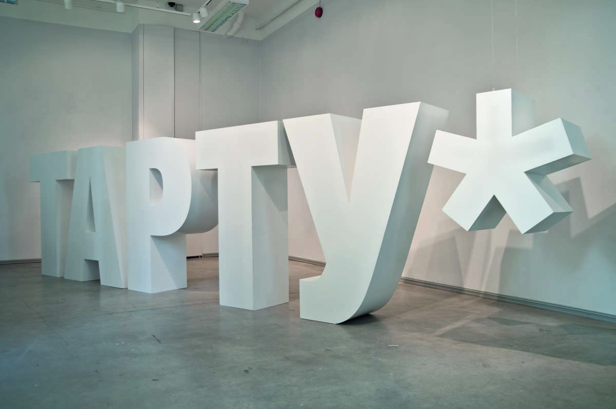
The viewer can enjoy the exhibition even more if he is aware of what Dénes Farkas and Taavi Talve have achieved individually. The characteristic interests of both artists, their handwriting and methods, have deliciously blended in the new joint project. The latter contains Dénes’s recognisable white interior and architectural models made for his photographic performances and his passion for various linguistic and translation issues. The project also clearly shows Taavi’s background as a sculptor, his experience of ideological discursive speech and of analysing different (analogue and digital) methods of conveying information. The viewer might also notice that the letter combination APT is simultaneously a new independent work, as well as part of the exhibition Joonealused (Footnotes), which took place in Tartu and presented the word TAPTY, i.e. the name of the town in the Cyrillic alphabet.
Finally, I would like to describe the ‘duck-rabbit’ effect of Dénes and Taavi’s work and show where Gombrich made a mistake. With the first glance at the sculpture, the viewer immediately pronounces in his mind the word ‘art’ and understands it. At the next, more thorough look, comes the ‘tongue-in-cheek’ realisation that ‘art’ is written in Cyrillic, the Latin ‘P’ is the Russian ‘R’. The brain or past experience chooses a more logical pronunciation instead of the nonsense-word ‘apt’, at the same time mixing up the experience of the two ‘first foreign languages’. The context – the Russian footnote on the wall and the Russian embassy across the road – certainly encourages the viewer to read the middle letter of the word in Cyrillic. However, a chat with art students who were born in the early 1990s and thus have no overwhelming experience of the Russian language, confirmed that, in their case, such association did not arise. No illusion emerged. I thus think that Footnotes 2 produces simultaneous illusions, and does not demand an alternative switch from one code to another.
The semiotic language and reception game is finished off with the wall text, which – if understood – does not allow any dispute. Indeed, all of the letters of this word are familiar to me and the word cannot be found in Estonian, English or Russian dictionaries. The only thing to be argued about is the comprehensibility of meaning, but there actually is no argument, as we have to agree with the views of many authors that if art or an artistic text is fully comprehensible, it would lose its point. After all, the sense and meaning of art cannot be found in a dictionary either.