
Jaan Elken’s exhibition Back to Hyper-reality in the Adamson-Eric Museum and Tiit Pääsuke’s  retrospective in the halls of the House of Estonian Nobility of the Art Museum provoke further discussion about the meaning of hyper-reality and its Estonian variations. Just as Ilmar Kruusamäe’s retrospective a few years ago, and the Tartu exhibition of 1970s Estonian art unleashed nostalgic reminiscences about a period that remained but a brief experiment for most artists, the fact that the currently exhibiting Elken and Pääsuke belong among the hyper-realists has more to do with the period than with their work. At the same time, Elken’s exhibition in particular could be a platform from which to take a retrospective look at Estonian hyper-realism, to discover how it has changed. Quite a few meanings have been consigned to oblivion, faded away or become insignificant; some, on the other hand, are only now being noted.
Looking back: three waves of hyper-realism
All attempts to describe Estonian art inevitably encounter the same problem – the terminology adopted from Western art is based on Western criteria,  which are not always applicable to the local context. Each term must therefore be redefined within the local context, taking into account those parts of Western culture that have not found assimilation here. During the 1970s it seemed that we had finally reached some synchronisation with the West in that the first hyper-realistic paintings were painted here in 1975. But of course the difference in life-styles remained enormous, especially in those phases of life that were responsible for producing the trend in the first place. What’s more – for Estonian citizens, the West as a concept became an ideal. For those reasons, it is natural, that any discussion about the reception of hyper-realism in Estonia must start with considering whether it was possible for it to emerge here at all in its pure form – there was, after all, no metropolis, no contemporary big city and no phenomena of a super-civilisation. The more striking features of hyper realism, such as clear colours and gloss were absent on the Orwo and Svema slide films. Marshall McLuhan’s analyses of contemporary society and the slogan “the medium is the message” are more philosophy than fact, but ‘hyper’ acquired an important position also in Estonia. Hyper-realism has no single definition even in the West, where distinctions have sometimes been drawn between hyper-realism and photo-realism. In Estonian art criticism this became the main theoretical problem, and similar discussions clearly reveal the complicated nature of local art and refer to the problem of the purity of its style. Attempts have been made to replace, supplement and divide hyper-realism with various euphemisms, such as slide painting, new documentalism, objectiveness, “fascination with items”. Differentiation between hyper and photo-realism was most meaningful in cases where the latter does not use photo-effects to create simulacrum, but rather uses photos to facilitate the painting of realistic pictures. Three waves can be distinguished in Estonian hyper-realism. The first wave is associated with artists of the avant garde trend who reached hyper realism in the mid-1970s by way of pop art. Those were Ando Keskküla and Andres Tolts, also Tõnu and Irene Virve and Urmas Pedanik whose “schemes” belong among the most hyper-realistic of all. The second trend that was developed by young Tartu artists in the aftermath of hyper-realism in the late 1970s and the beginning of the next decade, can be treated as photo-realism. The subject matter also changed – the realities in setting are replaced by the social surroundings, i.e. we and our surroundings. This was refabricating the realism of small towns, with numerous allusions to local life and people. In truth, a real portraits-of-friends-boom occurred that reduced urbanism and painting of a techno-civilisation to sentimentality and the salon-style. However, the absence in context partly resulted in the pretension of hyper-realism flowing into localness . Ilmar Kruusamäe and Miljard Kilk should be mentioned here. The third wave in the 1980s did not bring new motifs, but rather a change of attitude towards motifs. Photo-realism prevails, although technically it is increasingly abandoned. What is sought is greater picturesqueness and thus subjectivity. On the other hand, this offers the main line in art motifs to renew itself, picturesqueness is forced to debate with photo. There is reason to include both Tiit Pääsuke and Jaan Elken in the third wave.
Hyper-realism Estonian style
Hyper-realism in Estonian art is characterised by a certain topsy-turviness – instead of deconstruction and shift, the method it uses is a kind of design, designing (the environment), and secretly yearning for everything Western. That is the far-from-reality, non-existent actuality that is evident in these pictures. Quite a few remember this as a way to escape, because they resembled the glossy pictures of the yearned  for, unattainable West. “Hyper-realism seen in reproductions of freedom-flavoured glass cases, of skyscrapers, of McDonalds and other fast food places by a highway seemed, instead of an awful reality, an unattainable dream, and the only way to get the dream’s domestic version was to combine the foreign glossy style with local motifs.” Vladimir Taiger’s Barracuda (1975) was the best expression of the Estonian “American Dream” of that time. What we had then was the Soviet reality with its paraphernalia, symbols and standard attitudes. Artists painted what was understandable to local viewers and recognisable on the level of everyday banality. Hyper-realism in Estonia proceeded along the path introduced by a local attempt at pop art. Hyper-realism thus actually brings several ideas of pop art to life. It becomes a visualiser of banalities and everyday reality, a gesture that belongs to pop culture and not to the avant garde. In that sense, it is apolitical (or politically ambiguous), not innovative in form, but popular instead. Its aim is therefore youth and mass culture, borrowing from their pictorial language and seeking their understanding. This was a desire to be pop. Art critic Hanno Soans regards three paintings by Ilmar Kruusamäe, One More Bit, Make Love Not War, and Olympia, the most appetising works for the archaeology of Estonian pop culture.
These paintings exhibit an open yearning for everything Western which of course makes them pure kitsch. The latter indeed looks like a key word that has quietly attached itself to hyper-realism. (It may seem that we have mixed up hyper and pop, but hyper actually became an art closest to youth culture.  This is especially applicable to the Tartu artists of hyper’s second wave who liked to portray their circle of friends, and to drop allusions to local (art) life.) One additonal work should be considered here – Tõnu Virve’s Estonian Maiden (1975). At first glance, this hyper-realistic piece is nothing more than a sickly sweet socialist realistic media icon – exactly like a reproduction from the Soviet youth magazine Ogonjok. It can, however, be interpreted in different ways if we consider its effect. “Hyper”-effect refers to something beyond reality. This is realism taken to perfection, to the absolute, where it paradoxically becomes the opposite. Looking at hyper-realistic paintings, we perceive a strong sense of unreality, because they have been painted with a photographic precision, which surpasses the human eye. We can thus say about Estonian Maiden and perhaps about a few other paintings (e.g. Virve’s Weighing) that their iconographic super-precision turns the dislocated into the absurd. The motif and colours copied from a Stalinist propaganda poster become an ironic socio-political commentary, echoing Estonian artist Leonhard Lapin’s idea of composite pop. This style stands closer to Russian conceptualism, the Soviet version of “hyper-realism” – i.e. hypertrophied socialist realism, cultivated by several underground Russian artists that was more acceptable in this part of the world. But how to answer the question which was so urgent at the time: was it an avant garde trend or a conservative position? As it is (was) seen, its interpretation involved politics, social irony, intellectualism, which seem to designate its hyper-realism as an avant garde gesture. This, however, is only a delaying self-deception, an extension of something that has essentially already ended. As a rule, hyper-realism is assumed to want avoidance of any kind of message. The Estonian style hyper, on the other hand, seems to function quite the other way. Dodging the formal topics of the trend, this otherwise perhaps overly poster-like and formal tendency (which was here threatened by hints at collaboration) tried to become more compact and weightier with the help of messages. Similar form-innovative torpor refers to localism where politics, irony or just an anecdote become essential. Estonian hyper was accused of a too striking similarity with socialist realism. This kind of ambivalence allowed both the accusation of compromise and the compromise itself, hoping for rapid success. Even with a hindsight it is not easy to establish one or the other. Generations for whom cryptograms and continuous hide-and-seek with authorities are completely alien, might not understand this at all, or they may fail to fully see the connection with hyper-realism. Who today realises that the glass door in Keskküla’s North Estonian Landscape(1974) refers to the tightly closed border, and the packet of Belamor cigarettes to the border guards. At the time, hyper-realism was an altogether different escape route, ideologically hybrid and permitting various identifications, like the already mentioned ambiguity, a peculiar buffer between “two realisms”.
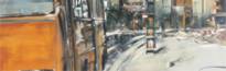
 The formal analysis that so fascinated the Americans, relying on camera effects, such as sharpness of depth and evenness, remained of secondary importance here. Instead, artists tried to cram psychological tensions and spiritual depth into their paintings. The masked existence of the humanist portrait genre in the Estonian version of hyper-realism has been noted by Hanno Soans. A wish to paint a photo-like (realistic?) picture attracts people more than an aloof cultivation of representation, or fiction and depiction games. Ando Keskküla is perhaps the only one who deals with manipulations and analyses of the viewers’ sense of vision. The cool appearance of his works resembles a snapshot. Yet even in his work, composition, space and structure strike the eye, turning the copy of reality into a reality construed by the artist himself. Jaan Elken, too, combines hyper with city motifs using methods of traditional painting. The nature and origin of Estonian hyper-realism’s alienated perception of urban life could be well explored on the basis of Elken (and Keskküla). In contrast to American city painters, Elken remains quite lyrical. The Estonian art critic Harry Liivrand has said that Elken’s work reveals the melancholy of big cities. This, however, is a yearning for a human and spiritual world, and not the anonymous wanderings of a flaneur who is enjoying the masses and his own solitude. Elken’s city is rather a strongly dramatised alienation process, empty of people. Rather than enjoying a big city’s phantasmagorias, reflections and speed, this alienation causes regret, and instead, often leads the artists into slums. For Estonian painting, a slum was of great significance – an assurance of security, survival and identity, a kind of symbol. Hyper-realism, on the other hand, has already abandoned this sort of slum-idea, and finds its motifs elsewhere. The human melancholy and misery of a slum is replaced by a grim, emotionless new residential area. Depictions of such areas are obvious reproaches which do not correspond to the utopia that served as the excuse for building them in the first place. A new housing development, after all, denotes something ugly; the artist is left with the remains that he throws away, with all the surrounding banality into which the visual flows – street signs, advertisements and graffiti. At the same time these seemingly casual excerpts and fragments become conceptual word plays and critical allusions (Kalevipoeg Close, Kalinin District). Elken’s paintings resemble subjective emotional map projections, rather than haphazard snapshots, even if they may seem like those at first glance.
Hyper-realism makes another leap The entire commercial city environment with its department  stores, cinemas, offices, places of entertainment, advertising, tableaux and the all-permissive and all-corrupting media arrived in the 1990s. Only after the arrival of “the consumers” city’ was it possible to paint the goings-on in the chaos of a commercial centre, to interpret the fragmentary and polyphonic nature of a modern city and the media world. Artists of the younger generation turn to slides and photos as well. Thus Jasper Zoova paints famous icons and pictures with bewildering preciseness. For example the heavy band Iron Maiden’s poster for the annual exhibition, or the sugary cover picture of , advertising Radio 2. Quite in accordance with widely recognised motto of hyper-realism – to take the trouble and spend time on purpose, for the sake of it, because a photo would manage quickly and effortlessly. Creating and seriously painting pop icons involves irony, the author himself is always a participant in the same world. Protest against a consumer society and the media is hedonistic criticism of that which the artist himself is a part of.